Bits & Bytes

Posts Tagged ‘absolute’

Clipping in JavaScript with Absolute Positioning

If you program games in JavaScript, you will often find it necessary to clip the region of an image that lies outside of the viewport. The solution is easy, but not obvious. The elements in a game are generally positioned using the “absolute” positioning designation: For example, the line qrMadonna.style.position = “absolute”; in the program below sets the positioning that the image of the Madonna, qrMadonna, refers to to absolute. (For an explanation of absolute positioning, see our post on positioning elements.)

Below, we have the code for an HTML file and a JavaScript file. The HTML file is essentially blank; it is simply used to call the JavaScript file, “ClipImage.js” and execute the code.

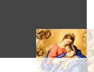
The file “ClipImage.js” contains four variables that refer to four nested HTML elements. The outermost element is the body; this element was created in the HTML file and is retrieved via a call to the getElementsByTagName() function, along with the array operator. After this, we create a div called qrOuterDiv to hold everything; this outer div is created to allow the code inside to flow normally, since it does not have absolute positioning (Otherwise, it is not needed.) The next element is qrInnerDiv, and it contains the image element that we are clipping; it is necessary that this element have its position as “absolute” and its overflow as “hidden”. Finally, the image element qrImage is 200×149 and is positioned at (125, 100) inside of the div, which is 300×200. So, the image hangs outside of the div by 25 and 49 pixels, respectively.

To illustrate this, we have an resulting image of what this clipping looks like below. The faint region that lies outside the dark gray rectangle is actually clipped. We show this region so that you can see what has been clipped. We also have the original image of the “Madonna and Child with Cherubs” that we used in the example, at the top of the article.

HTML File: “ClipImage.html”


<!DOCTYPE html PUBLIC "-//W3C//DTD XHTML 1.0 Transitional//EN"
"http://www.w3.org/TR/xhtml1/DTD/xhtml1-transitional.dtd">
<html xmlns="http://www.w3.org/1999/xhtml" xml:lang="en" lang="en">
<head>
    <meta http-equiv="Content-Type" content="text/html;charset=utf-8" />
    <title>XoaX.net's Javascript Clipping Example</title>
</head>
<body>
    <script type="text/javascript" src="ClipImage.js"></script>
</body>
</html>

JavaScript File: “ClipImage.js”


var qrBody;
var qrOuterDiv;
var qrInnerDiv;
var qrImage;

function PageLoaded() {
    // Get the main body element, first/only element of array
    qrBody = document.getElementsByTagName("body")[0];

    qrOuterDiv = document.createElement("div");
    qrBody.appendChild(qrOuterDiv);

    qrInnerDiv = document.createElement("div");
    qrInnerDiv.style.backgroundColor = "#444444";
    qrInnerDiv.style.width = "300px";
    qrInnerDiv.style.height = "200px";
    qrInnerDiv.style.position = "absolute";
    qrInnerDiv.style.overflow = "hidden";
    qrOuterDiv.appendChild(qrInnerDiv);

    qrImage = document.createElement("img");
    qrImage.src = "MadonnaAndChildWithCherubs.jpg";
    qrImage.style.position = "absolute";
    qrImage.style.left = "125px";
    qrImage.style.top = "100px";
    qrInnerDiv.appendChild(qrImage);
}

window.onload = PageLoaded;

Centering HTML Elements with CSS Absolute Positioning

Here, we have a medium gray, outer div element with a lighter gray div inside it. The inner div is 300 pixels by 250 pixels and has a 5 pixel wide border with a padding width of 10 pixels. So, the inner div is 2*5 + 2*10 + 300 = 330 pixels wide and 2*5 + 2*10 + 250 = 280 pixels high. The outer div has a 30 pixel margin around it for presentation.

(Proverbs 20:1-4) Wine is a luxurious thing, and drunkenness riotous: whosoever is delighted therewith shall not be wise. As the roaring of a lion, so also is the dread of a king: he that provoketh him, sinneth against his own soul. It is an honour for a man to separate himself from quarrels: but all fools are meddling with reproaches. Because of the cold the sluggard would not plough: he shall beg therefore in the summer, and it shall not be given him.

To center a block element both vertically and horizontally within another element, we use negative margins. However, first we set the left and top positions at 50%. This places the upper-left corner of the inner div in the center of the outer div. To correct this placement and put the center of the inner div in the center of the outer div, we use a negative margin that is half the size of the inner div in both the horizontal and vertical directions. These values are 330/2 = 165 and 280/2 = 140, respectively. So, the left and top margins are set to -165px and -140px. The HTML and CSS to create the effect above is shown below.


<div style="position:absolute; width:480px; height:360px; background-color:#aaaaaa; margin:30px;">

<div style="position:absolute; background-color:#DDDDDD; width:300px; height:250px; padding:10px; border:5px solid #444444; left:50%; top:50%; margin-left:-165px; margin-top:-140px;">

<p>(Proverbs 20:1-4) Wine is a luxurious thing, and drunkenness riotous: whosoever is delighted therewith shall not be wise. As the roaring of a lion, so also is the dread of a king: he that provoketh him, sinneth against his own soul. It is an honour for a man to separate himself from quarrels: but all fools are meddling with reproaches. Because of the cold the sluggard would not plough: he shall beg therefore in the summer, and it shall not be given him. </p>

</div>

</div>

Types of Positioning for HTML Elements with CSS

There are four positioning styles for HTML elements, which can be specified by a CSS style specification: static, relative, absolute, and fixed. Additionally, we can set the position style to be specified as inherited, in order to copy the positioning style of the parent element.


<div style="width:400px; height:200px; background-color:#aaaaaa; padding:10px; margin:5px;">

<p>"But what became of the young lady?" I asked.</p>

<div style="float:right; position:static; width:150px; height:50px; left:10px; top:20px; background-color:#333333;"></div>

<p style="width:400px;">"Do you really want to know?" he said, buttoning himself in his fur coat carefully. "I confess to the small malice of sending her Sevrin's diary. She went into retirement; then she went to Florence; then she went into retreat in a convent. I can't tell where she will go next. What does it matter? Gestures! Gestures! Mere gestures of her class."</p>

</div>

Above, we have the code for a container div element that contains three other elements: two p sections and a div section. We will focus on changing the position property for the inner div element, which is dark gray. The position specification is shown in bold and we will change the static specifier to change the style

static

The default positioning scheme is static, which simply positions elements as they appear in the normal document flow. The important point to remember about this style is that it ignores positioning specifications. So, if you set a position element like left, it will be ignored in static mode.

“But what became of the young lady?” I asked.

“Do you really want to know?” he said, buttoning himself in his fur coat carefully. “I confess to the small malice of sending her Sevrin’s diary. She went into retirement; then she went to Florence; then she went into retreat in a convent. I can’t tell where she will go next. What does it matter? Gestures! Gestures! Mere gestures of her class.”

In the static example above, the inner div section, which is dark gray, simply floats right. The text section, which comes afterward wraps around the floated div section. Also, the left and top specifications are ignored because of the static position specification.

relative

The relative position scheme acts like the static scheme, except that the element is moved after everything is positioned. We can think of it like this: All of the elements are placed according to the static rules. Then the relative element is moved from its static position by the amount specified by the position coordinates.

“But what became of the young lady?” I asked.

“Do you really want to know?” he said, buttoning himself in his fur coat carefully. “I confess to the small malice of sending her Sevrin’s diary. She went into retirement; then she went to Florence; then she went into retreat in a convent. I can’t tell where she will go next. What does it matter? Gestures! Gestures! Mere gestures of her class.”

In the relative example above, we see that everything is in the same place as it was, except that the element is move 10 pixels to the right and 20 pixels down. This happens because the left and top specifications are used to move it.

absolute

For the absolute specification, everything is first placed as though the positioned element does not exist. Then the positioned element, the dark gray rectangle, is positioned according to its containing element, the light gray rectangle.

“But what became of the young lady?” I asked.

“Do you really want to know?” he said, buttoning himself in his fur coat carefully. “I confess to the small malice of sending her Sevrin’s diary. She went into retirement; then she went to Florence; then she went into retreat in a convent. I can’t tell where she will go next. What does it matter? Gestures! Gestures! Mere gestures of her class.”

As we see in the example above, the absolute positioning means that no space is left for the floated div element and that that element is place 10 pixels to the right and 20 pixels down from the upper-left corner of the container because of the left and top specifications (Note that when the absolute positioned element is inside a static positioned div, as shown here, we need to nest an additional absolute positioned div inside the outer div. Otherwise, the position will be taken relative to an outer element–in this case, the whole browser window.).

fixed

The fixed specification works like the absolute specification in that everything is placed as though the positioned element did not exist. Then the positioned element is placed relative to the entire browser window. We did not show this example, because the behavior is too strange. The fixed element actually stays exactly where it is placed as you scroll up and down the page. It is very messy, and we will leave it to your imagination and simply say that the rectangle sits 10 pixels to the right and 20 pixels down from the corner of your browser window as you scroll.


© 2007–2024 XoaX.net LLC. All rights reserved.